
Kliniek Noord
A concept project about spatial calm, patient-led navigation and simple booking in healthcare.
Concept project. Created to demonstrate our approach. Not a real client engagement, no verified results.
View live concept (opens in a new tab)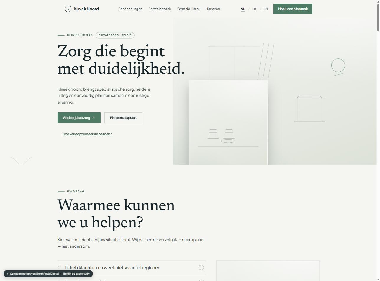
Challenge
Healthcare websites tend to fall into one of two traps: institutional and cold, or lifestyle-oriented and vague. Both leave the patient with the same open question — what can this clinic actually help me with, and how quickly can I find out? An earlier pass at this concept didn't solve that: it presented departments in tidy rectangular boxes, but still left the patient to work out which box applied to them.
Strategy
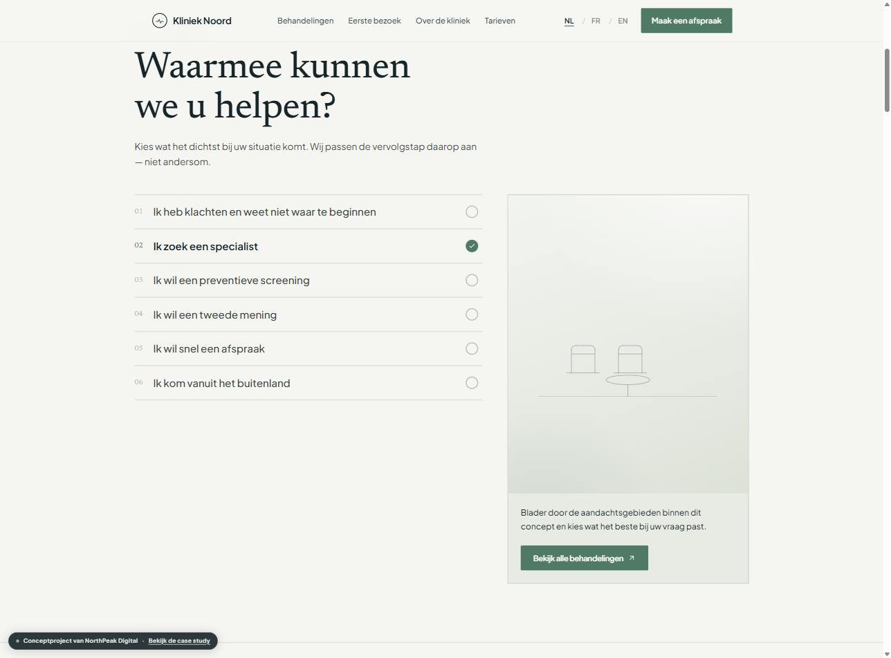
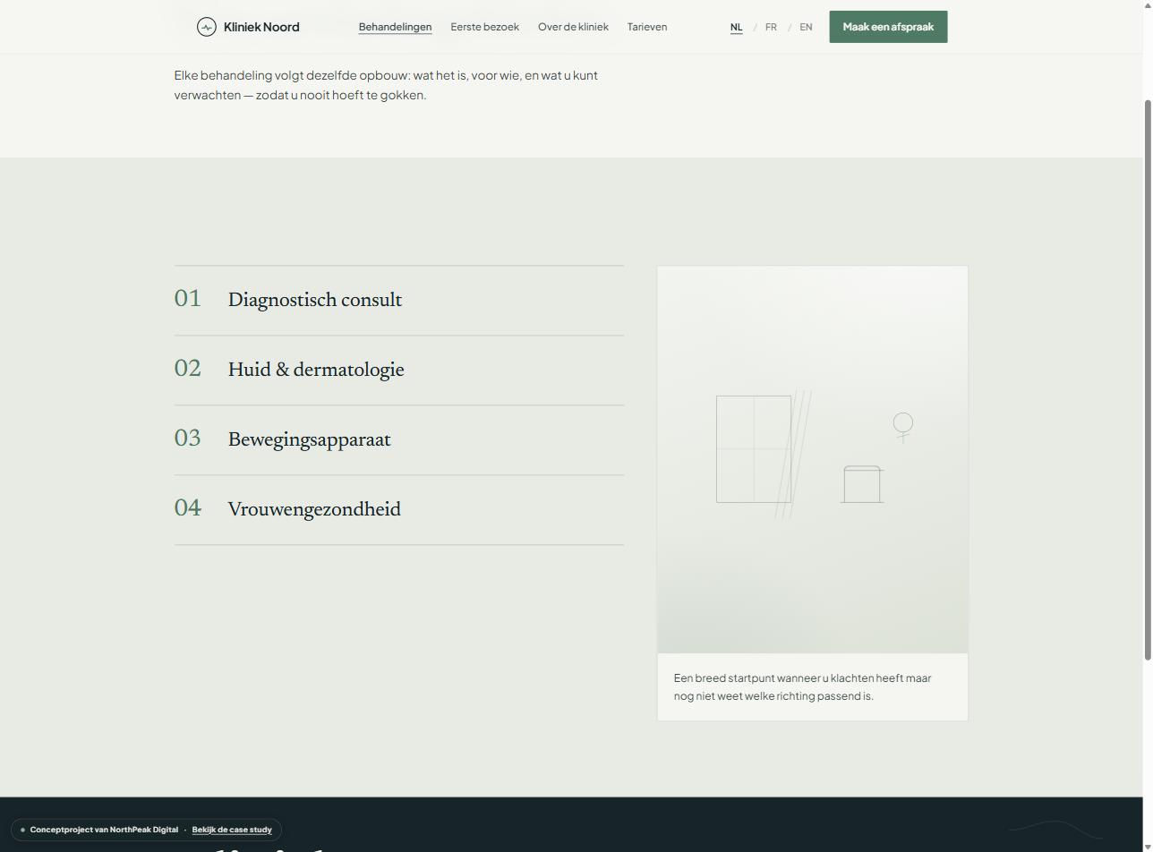
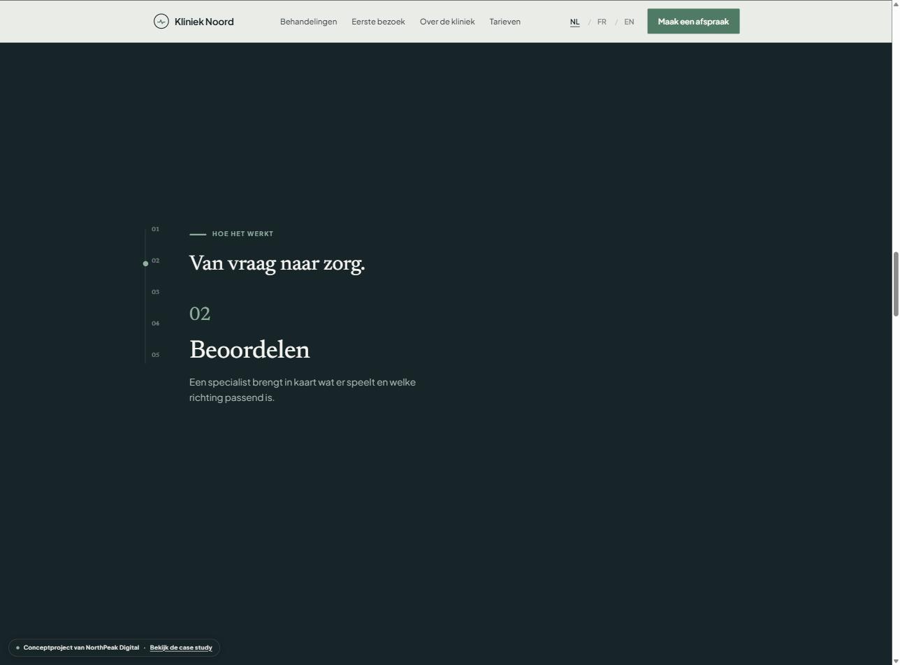
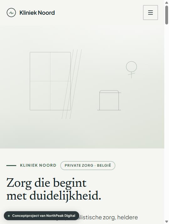
Problem-first rather than department-first: the site asks 'What can we help you with?' before it ever shows a department. A spatial, layered design — overlapping image planes, a sticky scroll sequence for the care journey, and an editorial treatment index instead of cards — replaces the straight stack of identical sections. Accessibility stayed the foundation throughout: every new interaction had to work by keyboard, nothing depended on hover, and a static alternative exists for anyone who prefers less motion.
Solution
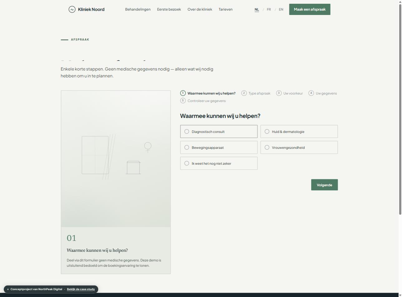
A patient navigator that maps six common situations to the right next step, a sticky 'From question to care' sequence with a care-path motif running through the site, and a booking experience where a step-aware context panel moves alongside the form — the form itself stayed unchanged: no medical data, an honest privacy notice, full keyboard support. Treatment pages still follow the same structure with an explicit 'what this consultation does/doesn't do'.
Outcome
As a concept, Kliniek Noord shows that a healthcare website can feel spatial and alive — with a patient navigator, a sticky care journey and an editorial treatment index — without losing the calm, accessibility and clarity that healthcare communication requires. This is a concept project, not a delivered client engagement — there are therefore no verified commercial results.
Deliverables
- Information architecture
- Patient navigator (concern-led UX)
- Sticky scrollytelling sequence
- Editorial treatment index
- Accessibility-first component system
- Responsive website
- NL / FR / EN implementation
- Integrated, accessible booking flow
- Privacy-conscious form UX
Verified metrics: not applicable for a concept project.
The website in view
Does your website make the step to an appointment easier?
NorthPeak builds healthcare websites that combine trust, accessibility and conversion without pressuring the patient.
Your next website should do more than look better.
No obligation. Practical recommendations. No generic automated report.